The Last Fireflies
It is a radical podcast that discusses climate change and presents relevant studies, along with poetry segments and organizing strategies, from a perspective rooted in Eastern Europe and the Balkans.
The Last Fireflies was founded by Robi, Ani, and M.
Illustration
Concept and themes
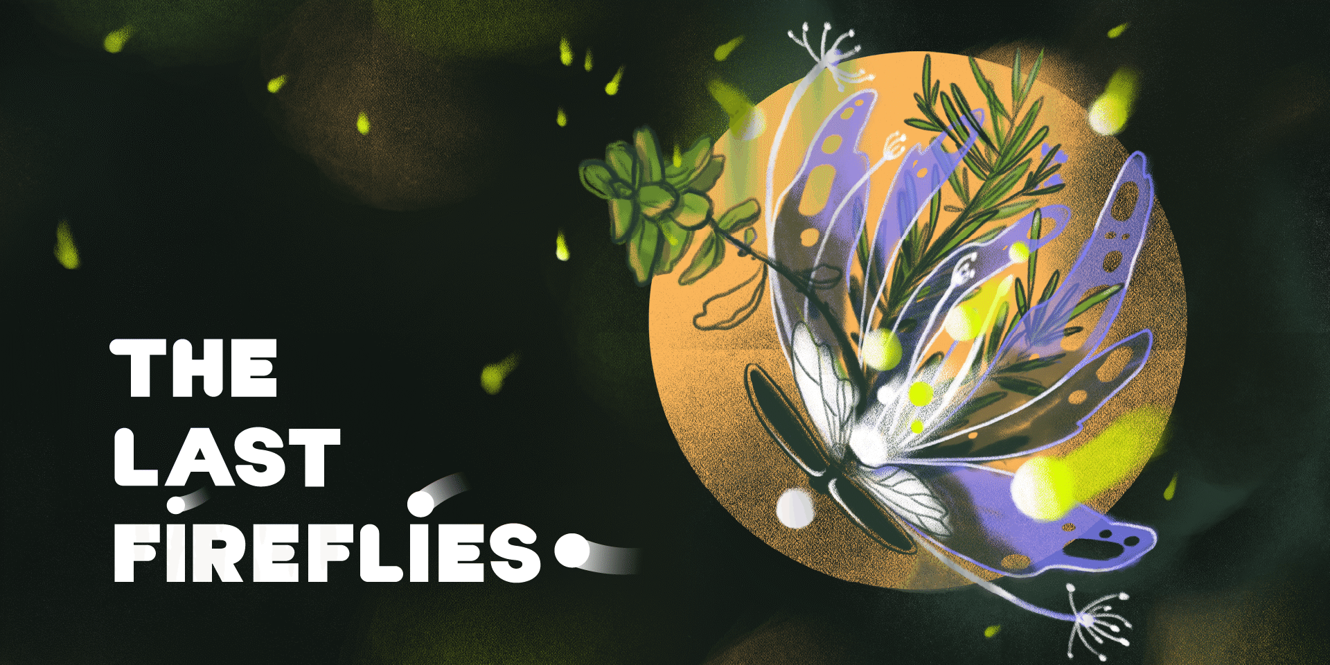
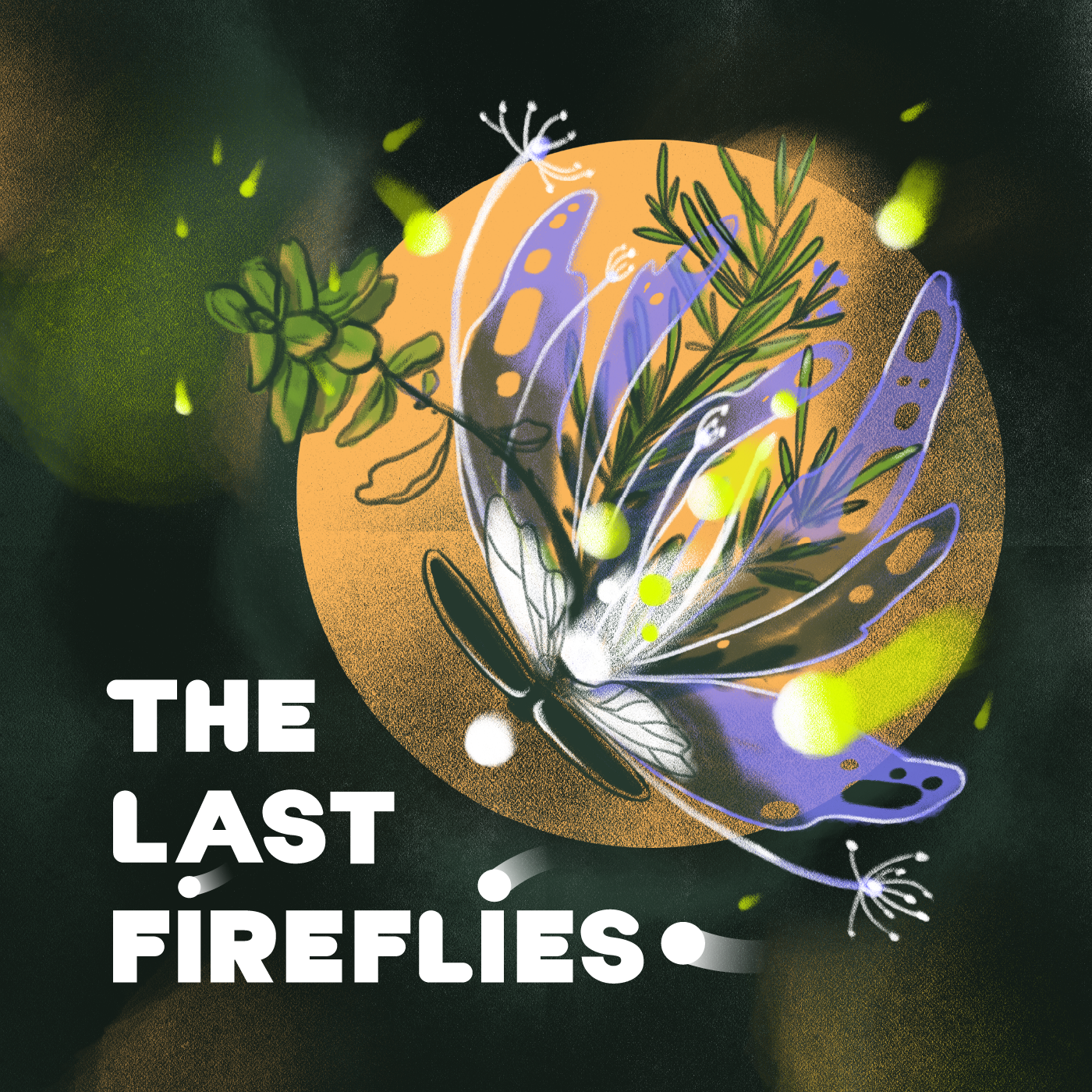
The illustration starts with a solarpunk theme and moves toward herbalism.
Logo and brand identity
-
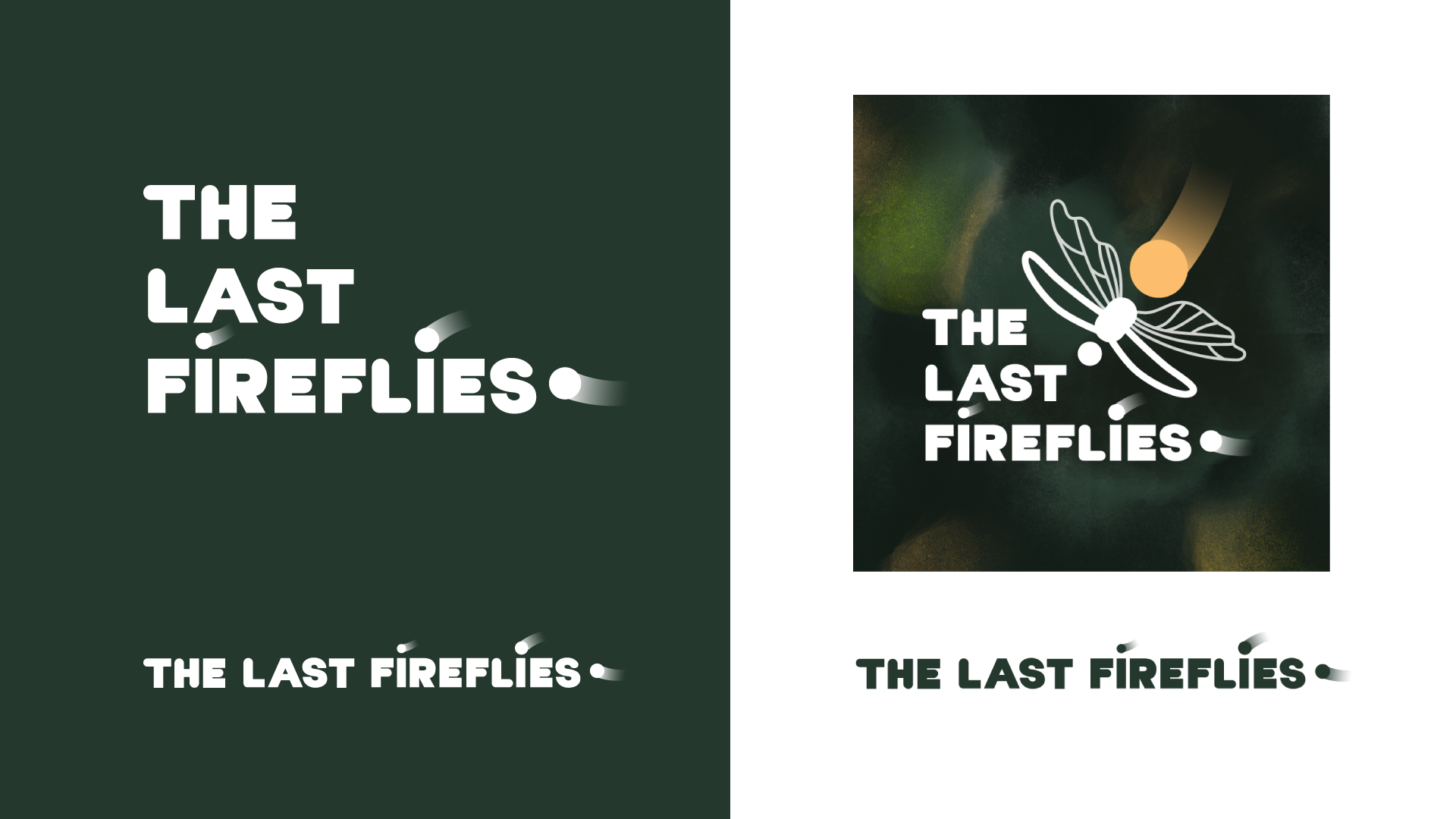
Logo
-
Cover Art
-
Branding Guideline (Font & Colors)
-
Icons
-
Covers
- dark green for the environment, ecosystem, vegetation
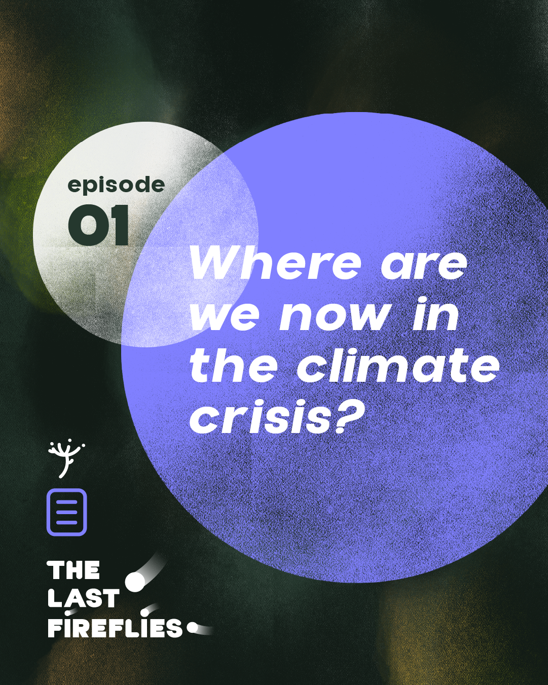
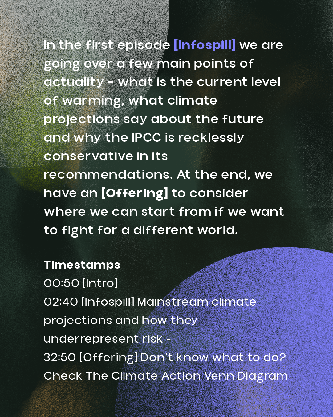
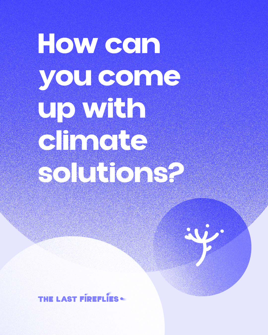
- blue - the section featuring scientific articles and information on climate change, used in the infospill sections
- orange—a warm shade for interview segments
- neon green – for a striking contrast that conveys danger and serves as a warning, used in the "Organization" and "How-to" sections
- white—to evoke a sense of calm and tranquility; used in the offerings section
- magenta—a more playful shade for recommendations
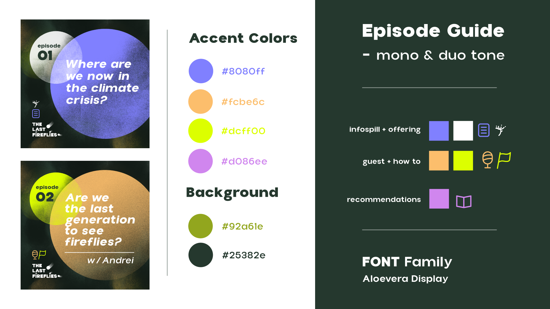
To establish the brand’s identity, I've created banners for the platforms where the episodes are available, a series of special categories for YouTube, three tiers for donations on Patreon, and a set of representative icons that appear in every episode as well as on social media platforms.








Design print
bookmarks
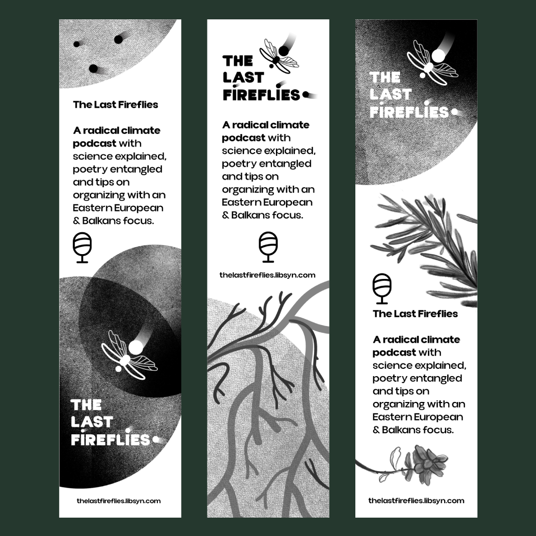
I've also created a series of bookmarks featuring elements from the main illustration, in black and white, to promote the podcast at fairs or events attended by creative professionals.
Social media
marketing for episodes
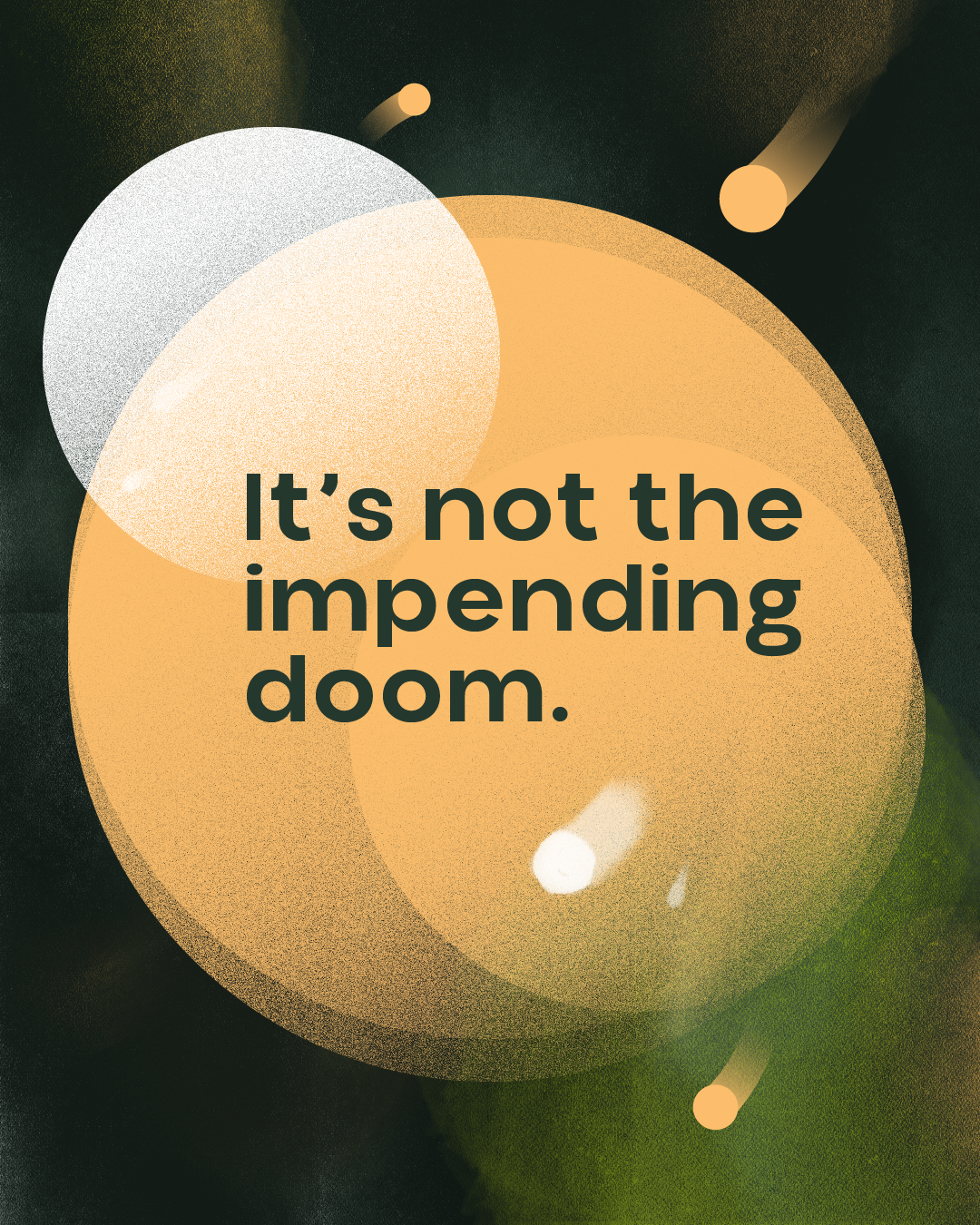
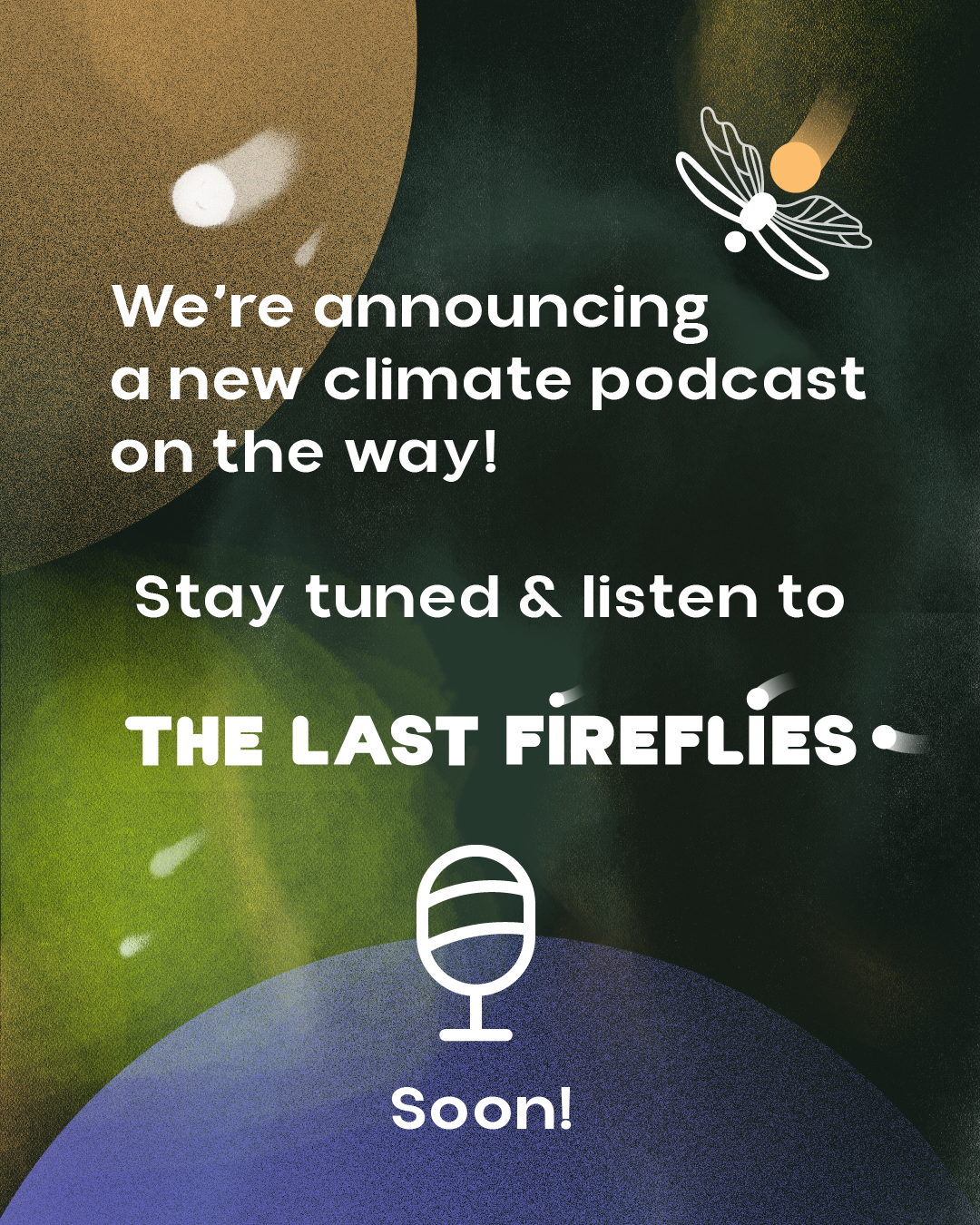
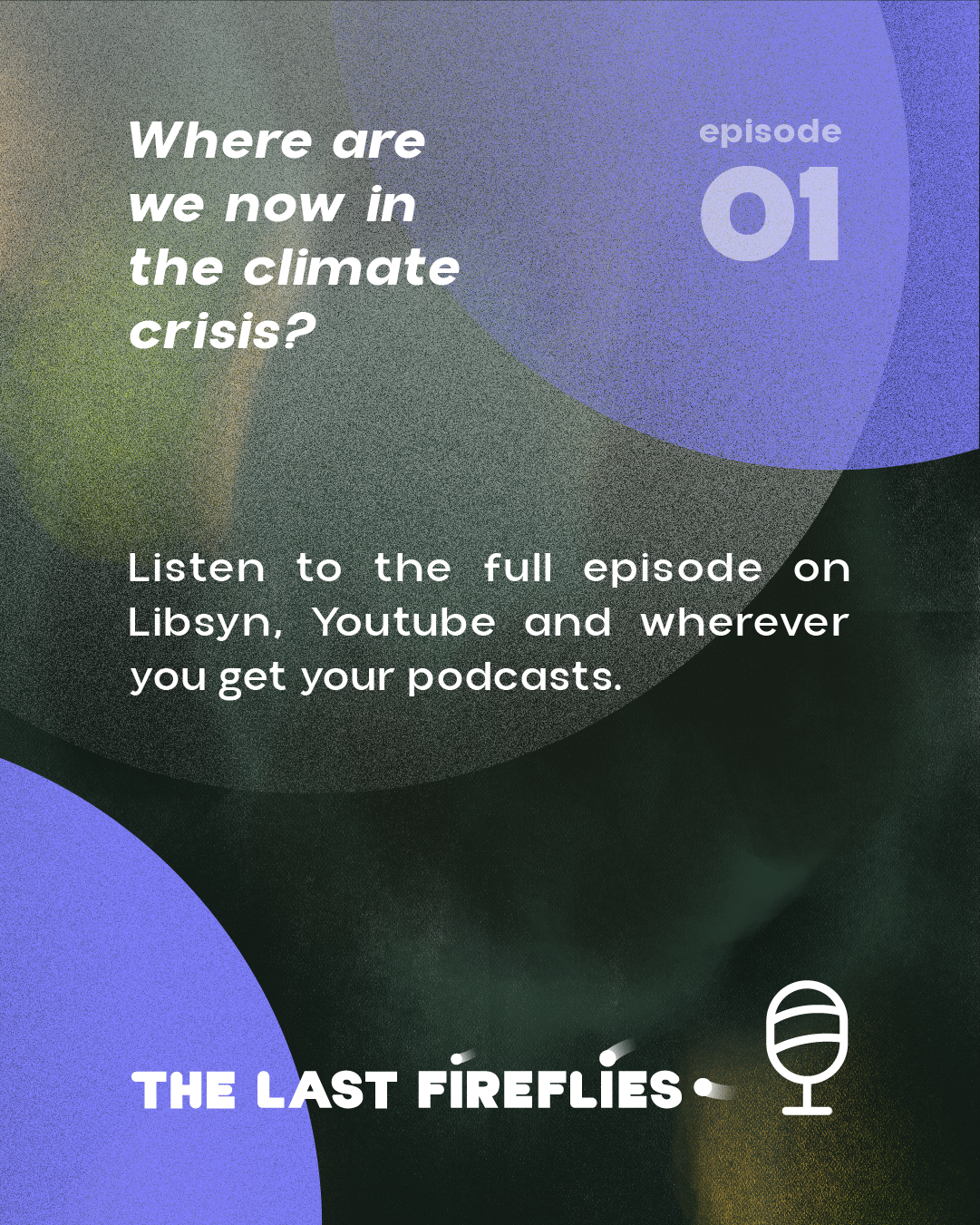
I worked on posts for the podcast launch and on promoting it, through posts that announced the topics it would cover and how it would be structured.
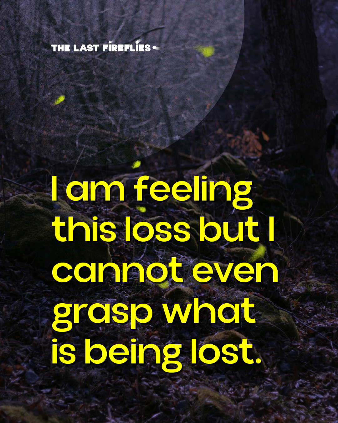
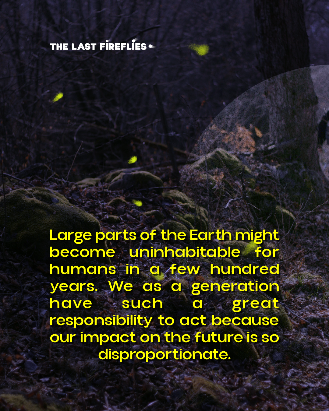
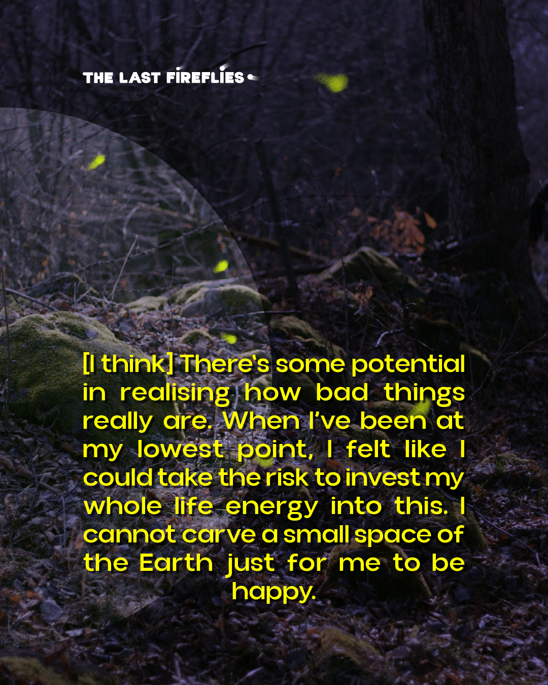
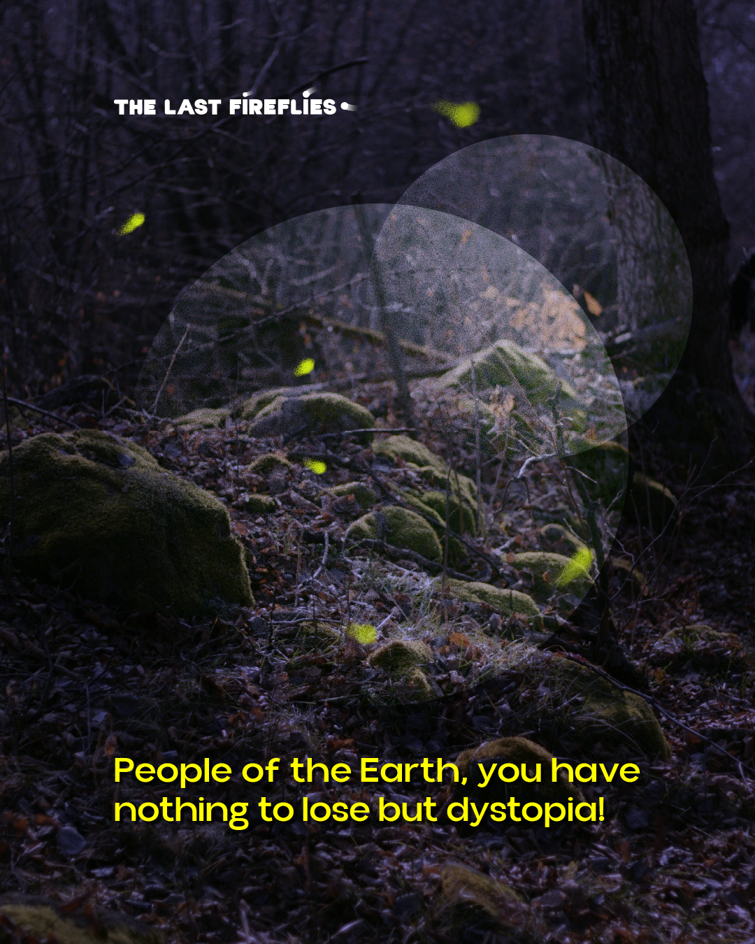
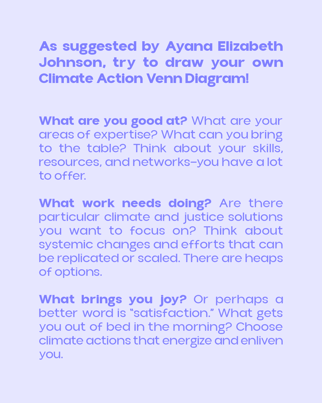
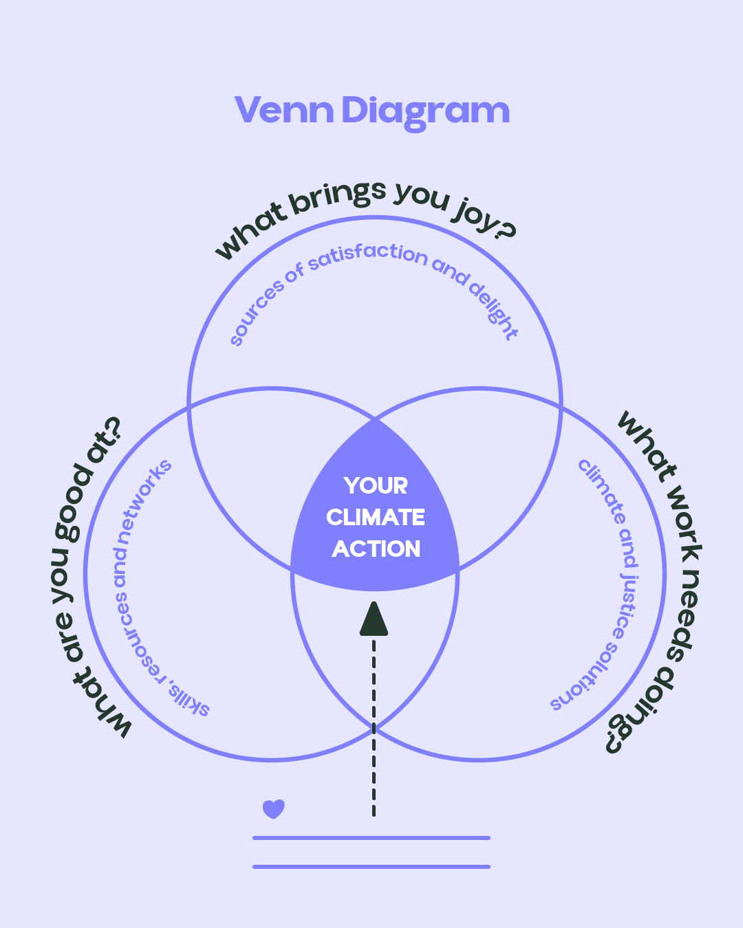
For each episode, I've created themed templates in colors representative of the categories, featuring excerpts from discussions with guests or moderators, as well as elements specific to each category—whether a short poem, a recommendation, or a suggestion for further activities.
For the graphics, I used textured circles and subtle brush strokes, photo inserts for teaser posts, and vector graphics for infographics.

Personal note
This project also has an activist component, through which I try to use my artistic skills to support organizations and groups fighting for climate justice and social justice.